
Marbury v.
Madison


Redaction is a bespoke typeface commissioned by Titus Kaphar and Reginald Dwayne Betts’ The Redaction exhibition at MoMA PS1. As part of a timely conversation at the intersection of history, the legal system and social justice, the fonts will be free for personal use. In a spirit of generosity, the artists invite everyone to broaden the ethos of the exhibition by making these tools accessible to a global and engaged audience.
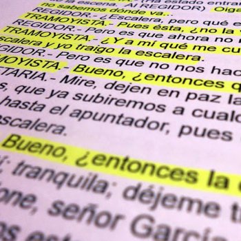
The Redaction project seeks to highlight the abuses in the criminal justice system, in particular the way poor and marginalized people are imprisoned for failure to pay court fines and fees. When Titus Kaphar and Reginald Dwayne Betts began their collaboration on The Redaction, they identified that typography should be an important extension of the work. Using legal documents from claims filed by the Civil Rights Corps as source material, Betts crafted new poems by redacting out superfluous information – text that is juxtaposed with Kaphar’s portraits of the individuals represented in the claims. This emphasis on text and legibility presented a unique design opportunity: to create a bespoke typeface that could be used in the work, and also serve as a scalable tool to raise awareness of the project and reach even more people. To fulfill the typographic potential of the project, Kaphar reached out to Forest Young, a colleague from Yale, now a Global Principal and Head of Design at Wolff Olins, who in turn recruited Jeremy Mickel, type designer and owner of MCKL.
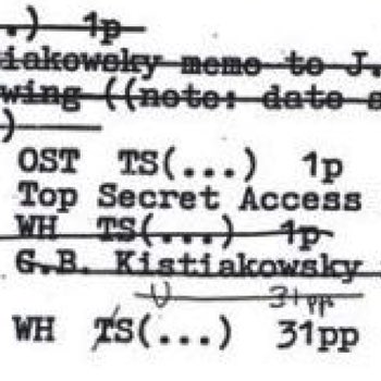
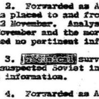
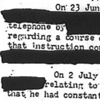
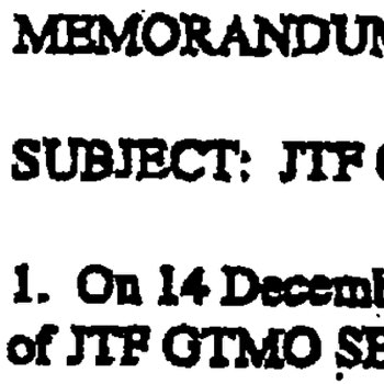
The first phase of the project consisted of research and immersion. It was imperative to learn as much as possible about the history and nature of legal documents, and the various approaches to redaction. Unsurprisingly, the designers found a spectrum of redaction: forms extending beyond the simple black box — an incomplete redaction; stamps marked ‘deleted’ but not obscuring the text; white boxes that appeared to invite the user to fill in their own text, and ad hoc handmade notations, among others.
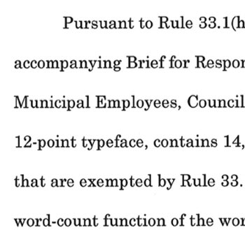
Specifically, the team noted that the vast majority of legal documents in the United States followed a set convention of using Times New Roman. The United States Supreme Court, however, dictates that all documents must be set in New Century Schoolbook. Both typefaces felt default, functional, and familiar. While they do not call attention to themselves at small size, they still command a sense of authority — attributes which the team hoped to emulate in their own design.
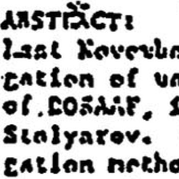
In reviewing historical source material, the team observed varying states of typographic degradation in the text of countless documents. As files were faxed, photocopied, and otherwise reproduced, the letterforms became bitmapped, bloated, warped, and were sometimes reduced to near-illegible forms. This particular aspect of variable legibility inspired subsequent experiments for future iterations of the fonts.
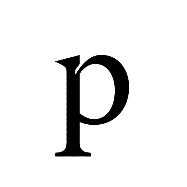
Times New Roman and New Century Schoolbook became the foundational pillars of legal typographic influence. The first goal was to draft something which simultaneously embodied both typefaces. While early tests of hybridization proved successful, the letterforms lacked a desired immediacy and contrast that could elevate them to both the abstract and conceptual, and ultimately be worthy of being incorporated into Kaphar and Betts’ work.

An early point of inspiration was the United States presidential seal, which depicts an eagle grasping arrows in one talon and an olive branch in the other. This was embraced as a potent metaphor for the extremes in the legal system: cruelty and compassion, war and diplomacy, hard and soft, white and black. This logic was then applied to the letterforms: teardrop shapes became supple and round, while acute shapes became razor sharp. When this exaggerated contrast resulted in an amplified tension, the team knew they were on the right track.

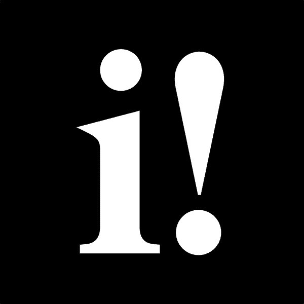
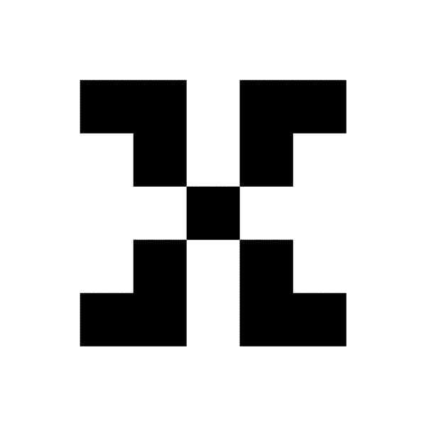
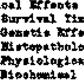
Pushing ahead, the team looked back at the early bitmap studies and document references and wondered if they could synthesize those details into the the font. By incorporating negative shapes into the letterforms, the. typeface could hint at the digital artifacts created through reproduction in fax machines and photocopiers. Peter Saville’s Power, Corruption, and Lies album cover for New Order served as additional inspiration; the unassuming color bar on an otherwise mundane floral still life effortlessly merges contemporary and historical narratives. A pixel fit nicely into the joins on characters like H E, but required bending and shaping to be convincing on the n s. Through trial and error, the letterform design followed an “inktrap logic” — to place negative shapes into as many of the glyphs as possible, with the additional pixel detail of a square tittle for the i dot and period.

It was always the hope to include bitmap grades of the font in order to reference the degradation of documents as they are reproduced through the legal process. As contemporary design moves through a zeitgeist of pixelation, with many incredible examples online, the team recalled the landmark designs by Susan Kare for the original Apple Operating System and many of Zuzana Licko’s early digital fonts for Emigre. The team maintained a conceptual framework for the degraded versions; it’s decidedly not merely an aesthetic. By providing a range of grades from subtly analog to nearly illegible, the typeface nods to the transformation and marginalization that many people face in the criminal justice system today, and specifically, the role and responsibility of the author of text to be conscious of legibility as a signature of power.

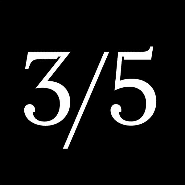
As part of the artists’ dedication to social justice and legal equity, the Redaction fonts are distributed under the Open Font License. You can use them freely in your products and projects – print or digital, commercial or otherwise. However, you can't sell the fonts on their own. The fonts are available in 3 styles (Regular, Italic, Bold) and 7 grades of degradation for a total of 21 fonts. All fonts have full character sets for Latin-1 language support.
The team is particularly excited to see how the Redaction fonts get used, and will showcase examples on the site in the future. Please keep in touch and share any examples of the fonts in use by contacting us at info@redaction.us.
Special thanks to Titus and Dwayne for extending the invitation to participate in this noble work. It is the team's hope that you will enjoy using Redaction.
Download
Credits —
The Redaction: Titus Kaphar and Reginald Dwayne Betts
Creative Direction: Forest Young
Typeface Design: Jeremy Mickel
Web Collaborator + Dev: Wilm Thoben
Web Collaborator + Development: Wilm Thoben
Python Scripting: Graham Bradley
Animations: Zipeng Zhu / Dazzle
Special Thanks to Jocelyn Miller, Alex Sloane, Taja Cheek, and Emily Shoyer at MoMA, and Natalie Renee at Kaphar Studio.